Scheduling card
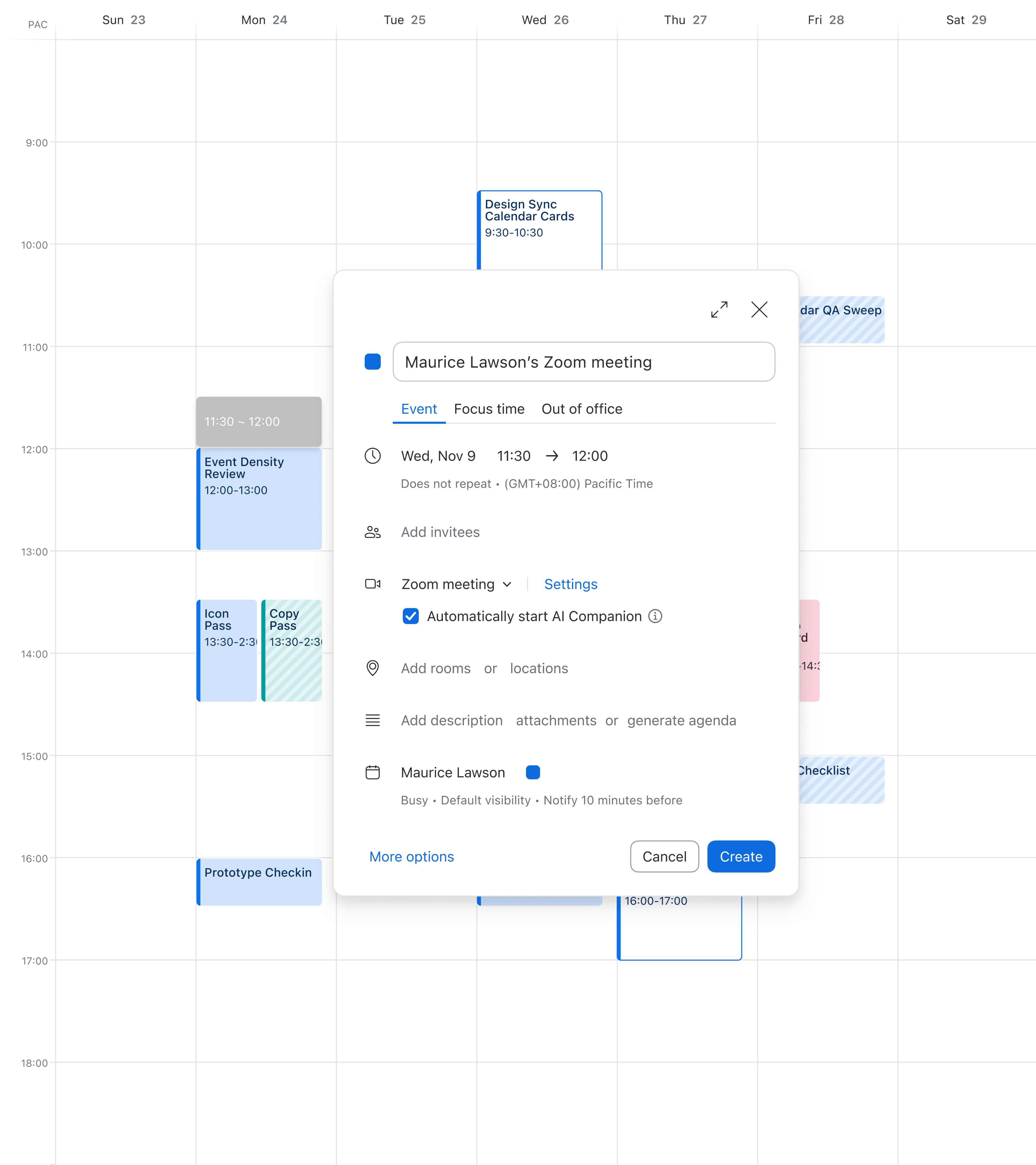
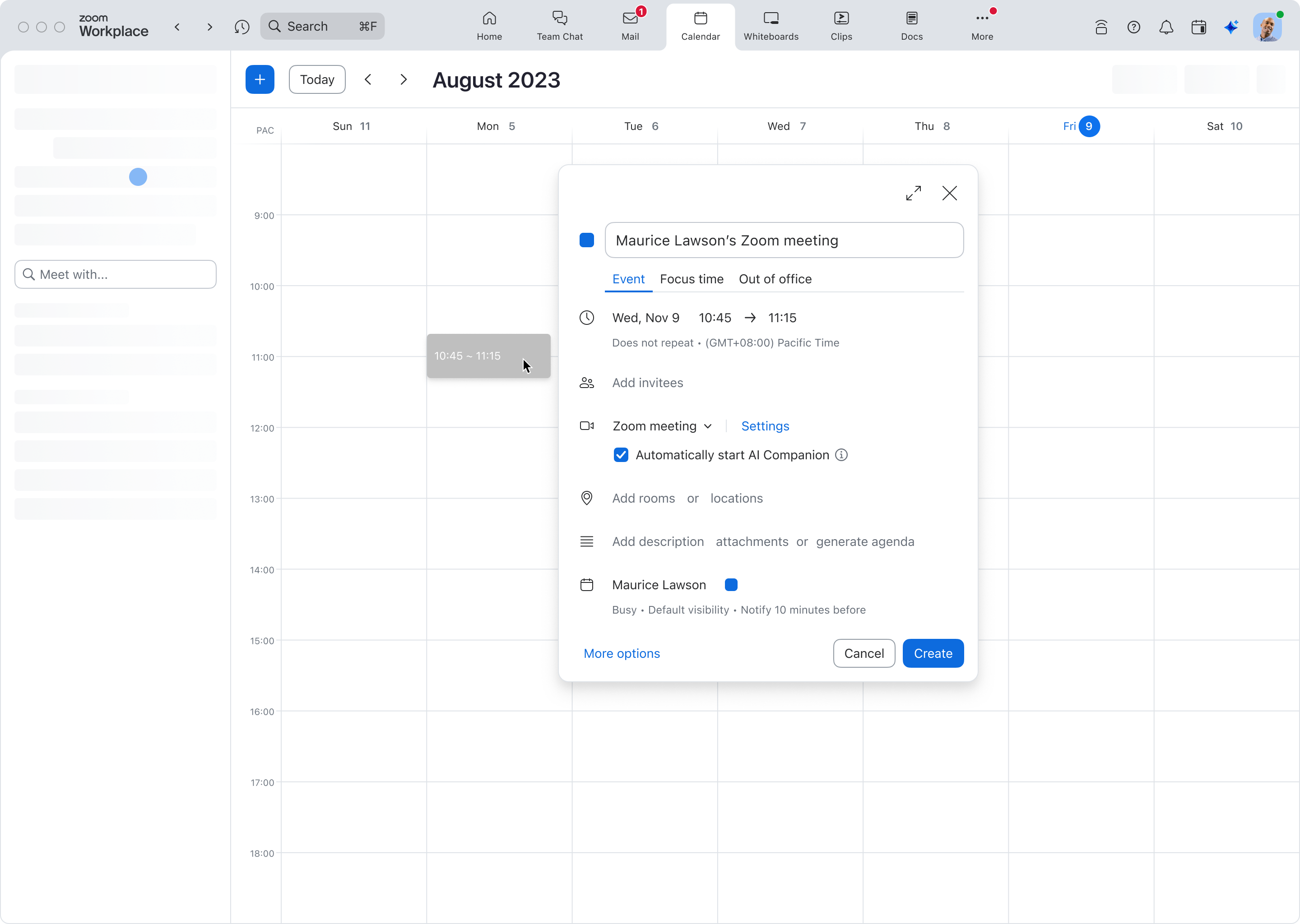
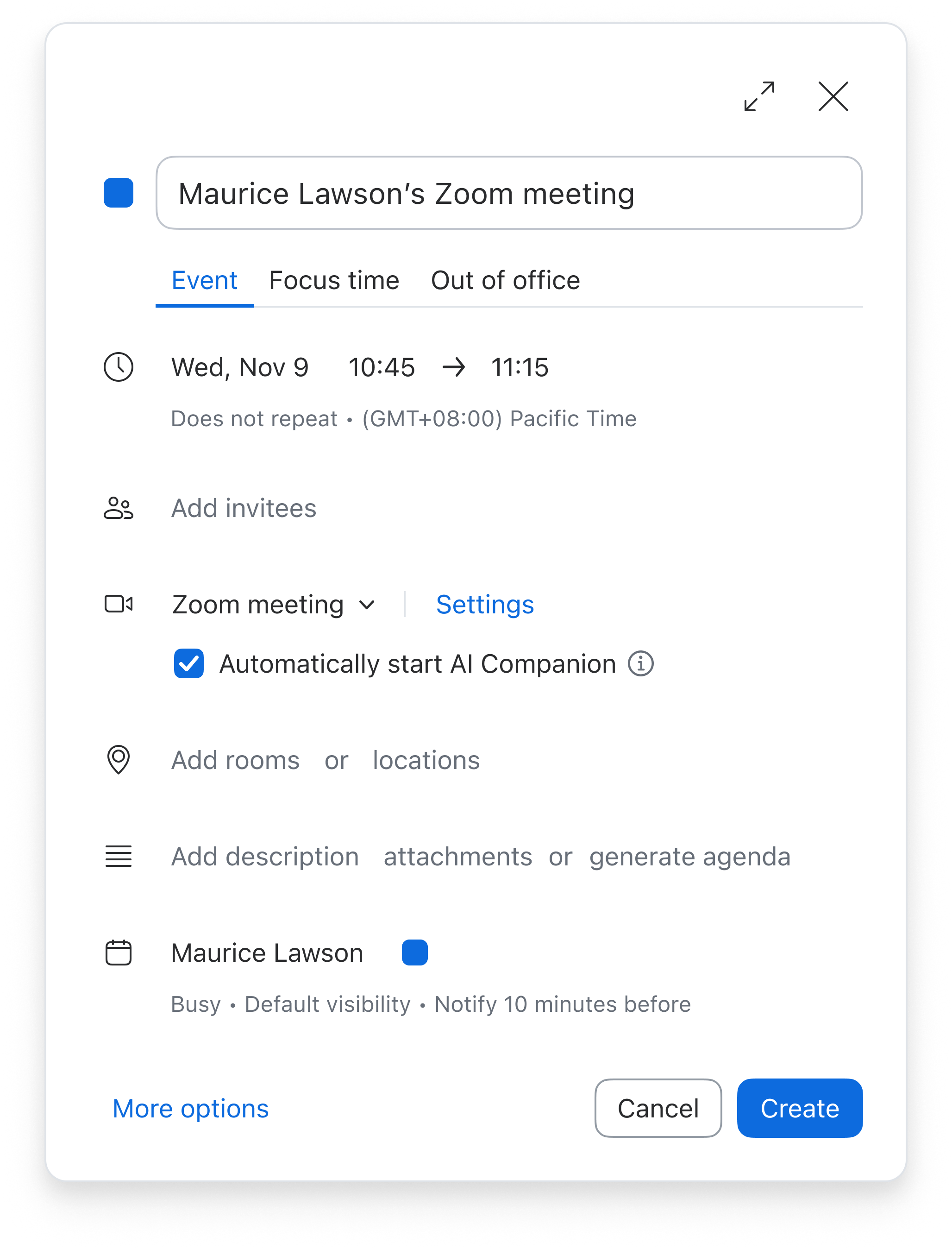
Clicking the calendar grid opens a card for entering event details and creating the event.
01 Cover
A clearer event creation experience for Zoom Calendar
I led the redesign of event creation, reorganizing complex settings and rethinking how users move between editing details and finding time. The work established interaction patterns later used across Calendar and Scheduler.




02 Existing flow
Clicking the calendar grid opens a card for entering event details and creating the event.
More options opens a larger window with the complete set of event settings.

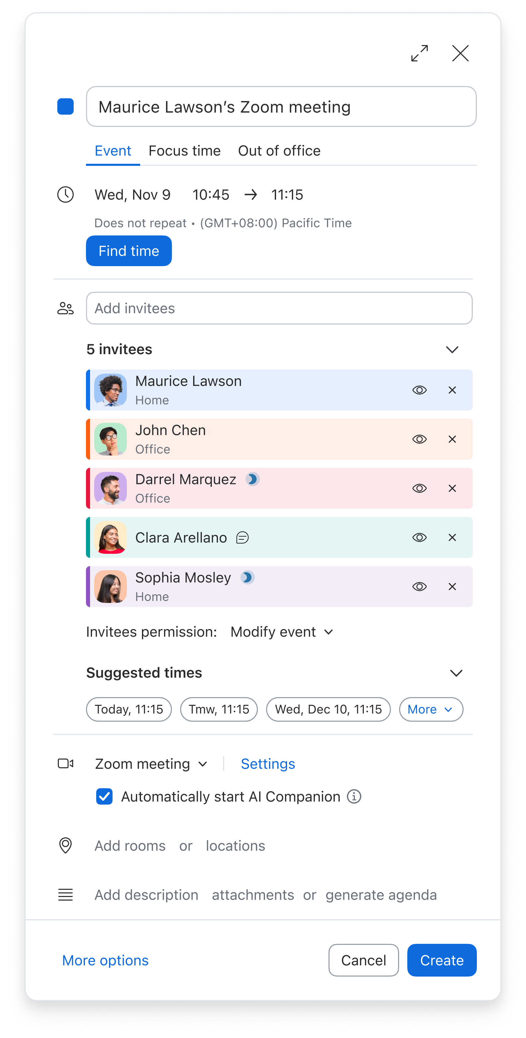
Find time opens a full-screen calendar with event settings alongside invitees’ availability.
03 Key problems
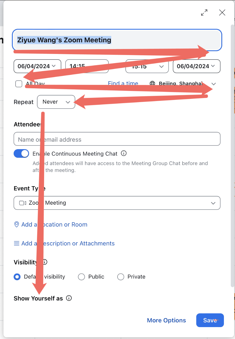
Many settings appeared as exposed inputs, with inconsistent alignment and little visual hierarchy. As an event became more complex, the card became harder to read.
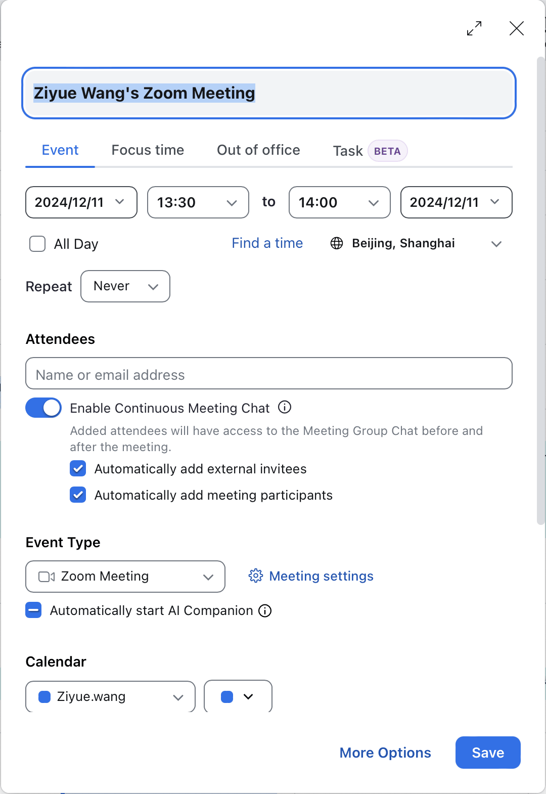
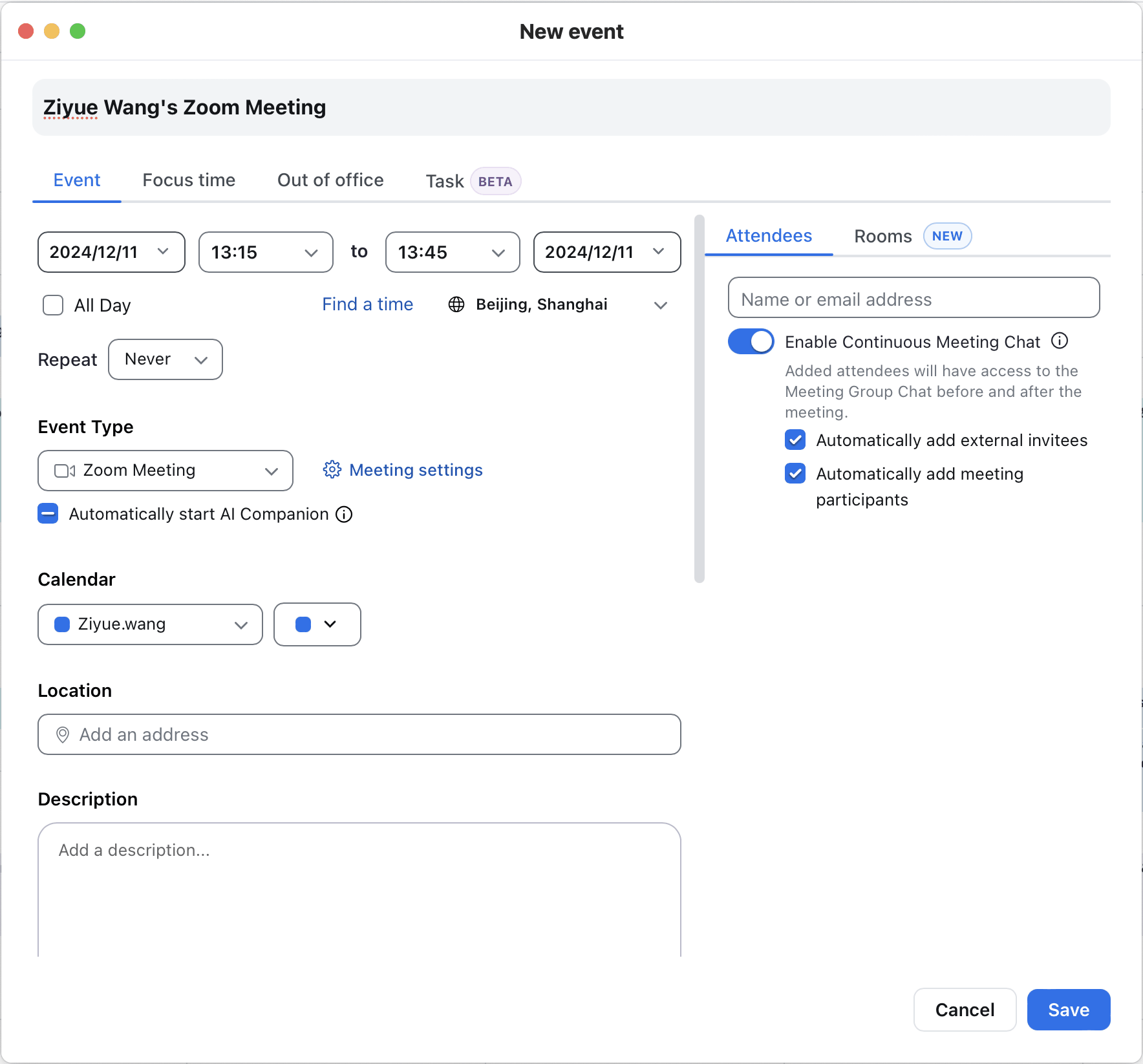
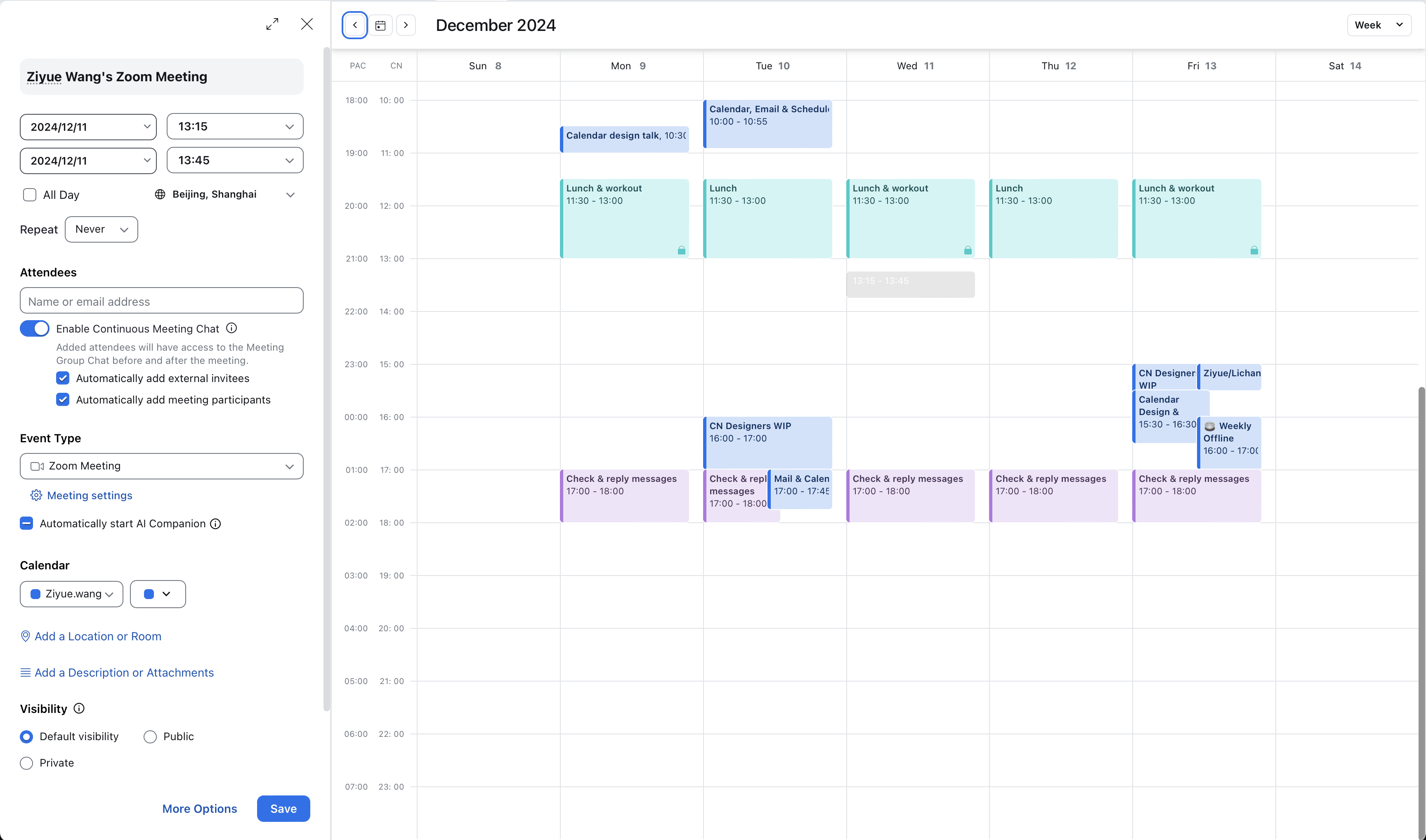
The card, expanded window, and Find time view offered overlapping capabilities in different layouts. Their roles and the reasons to switch between them were unclear.
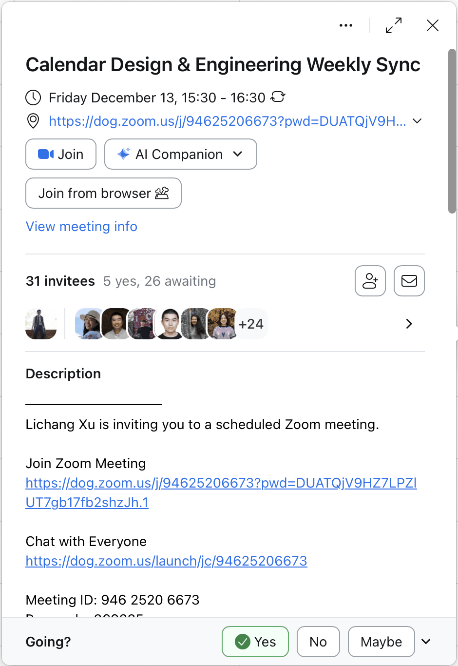
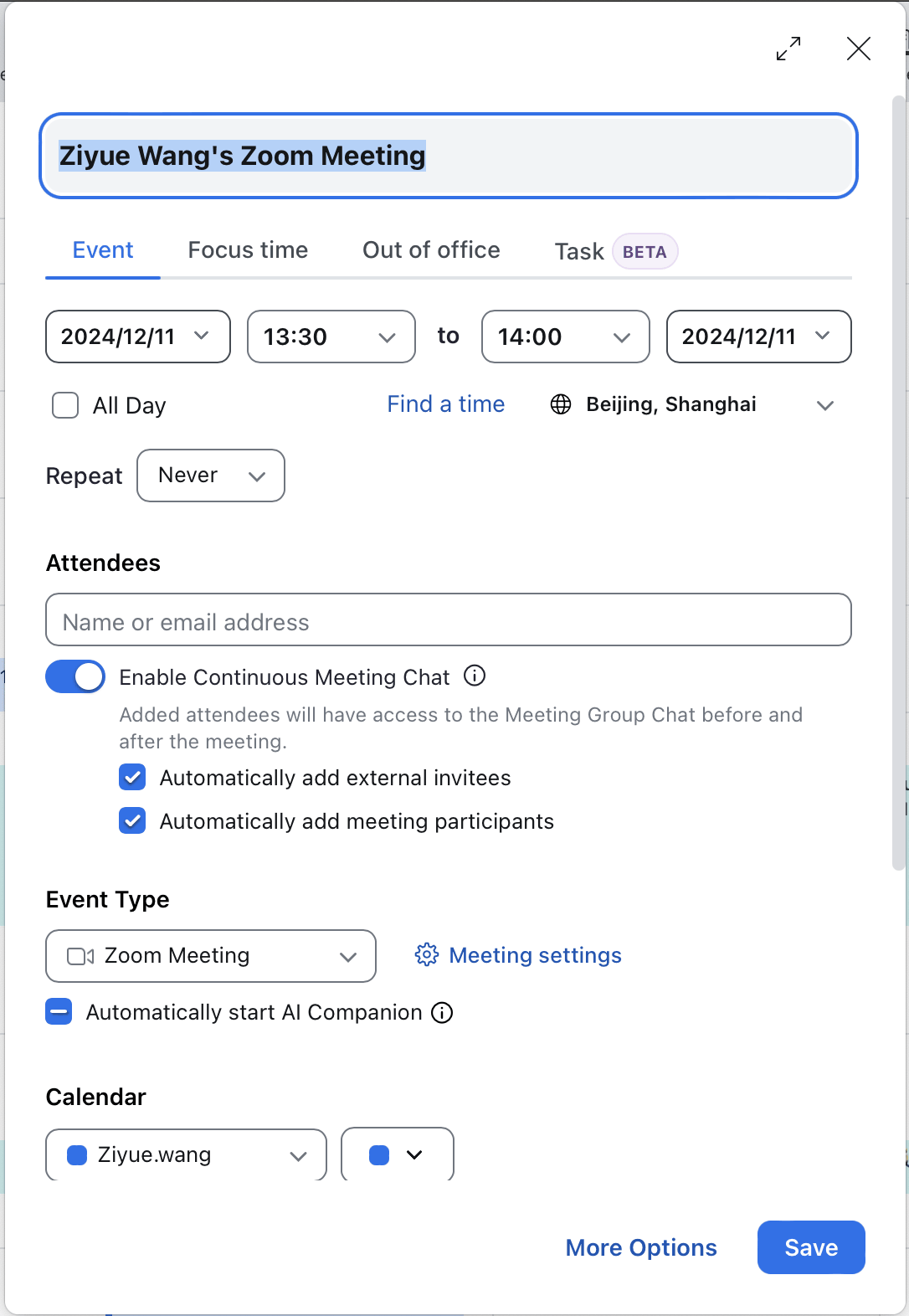
The creation form and the saved event card organized the same information differently. Users had few shared visual cues to connect editing with viewing an event.
04 Exploration
I explored six ways to organize settings and move between editing and finding time.
Three directions for connecting event details, Find time, and the main calendar.
Following Google Calendar, the scheduling card docks beside the main calendar for Find time. More options opens a details page with Find time embedded, keeping three views.
I recommended reducing three views to two, giving users fewer layouts and transitions to learn. With details and availability in one workspace, users can shift between editing and finding time by adjusting the layout.
⭐️
Find time opens as a dedicated page, accessible from both the scheduling card and the details page. This keeps three views, with no docking of the card into the main calendar.
05Overview
The redesign combines a clearer form with a simpler flow: settings stay easy to find and edit, while detailed setup and finding time share one workspace.
Collapsed sections keep the card visually simple, while summaries keep every setting discoverable. A single click reveals the relevant controls and activates the selected input.
06Progressive disclosure
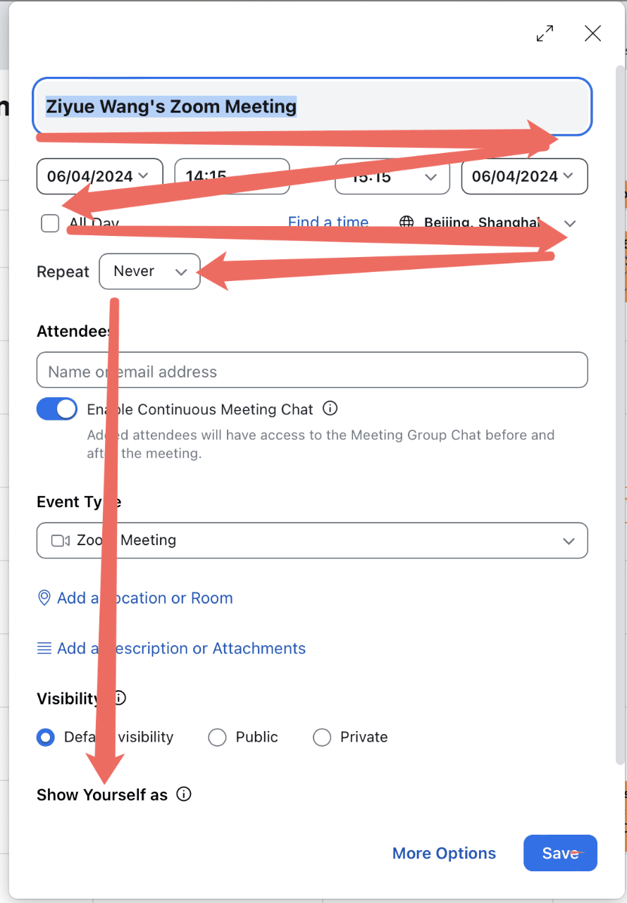


Exposed controls and inconsistent alignment made event settings difficult to scan.
Icons anchor each group, while compact summaries surface current values and available settings without exposing every input.
Sections are collapsed by default to keep the card clear and easy to scan. Clicking a section reveals all its settings, while summaries keep every editing option discoverable before expansion.
Every setting remains one click away from editing. Clicking a summarized field expands its section and activates the input in the same action, with hover cues showing where to click.
07Two views
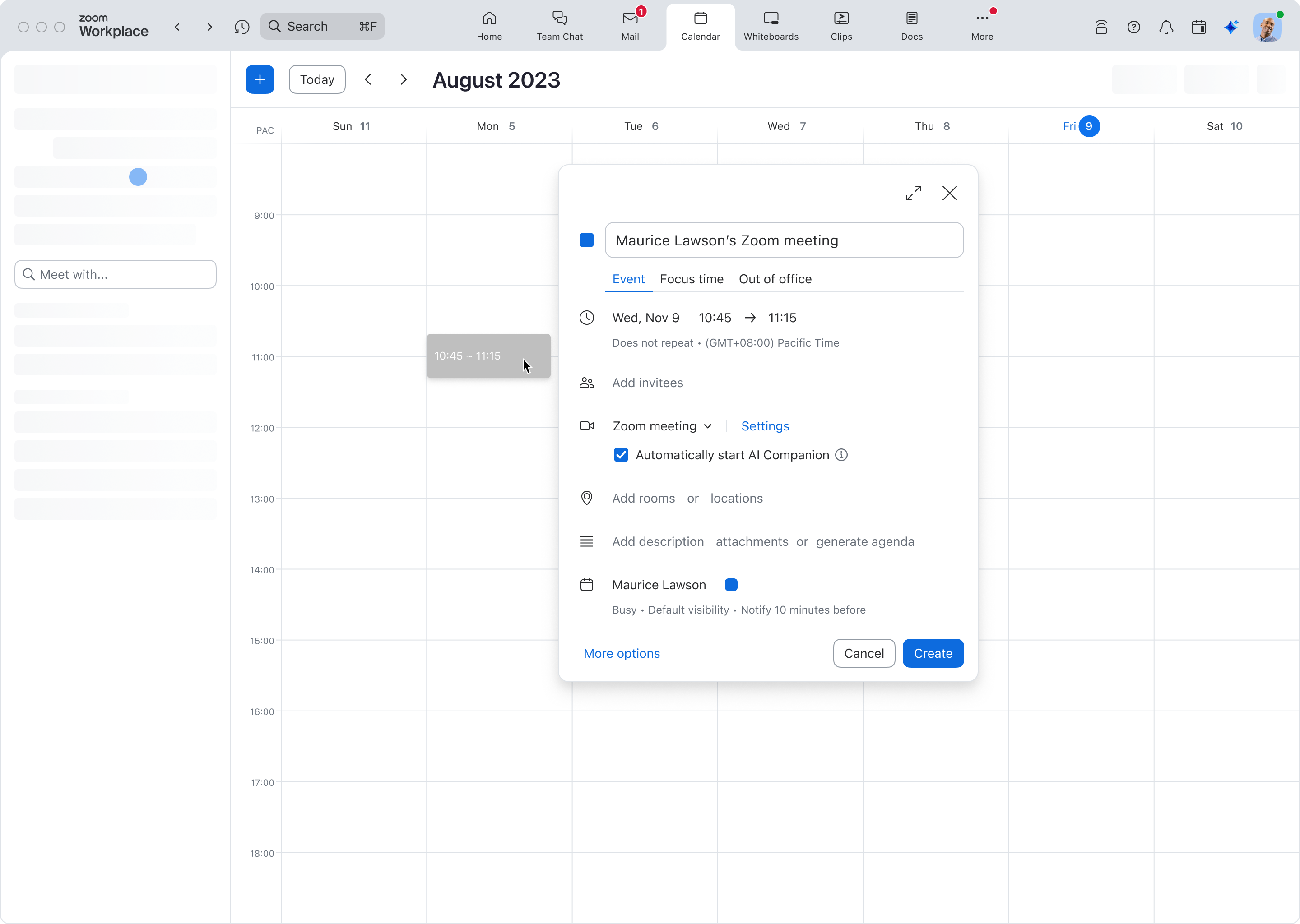
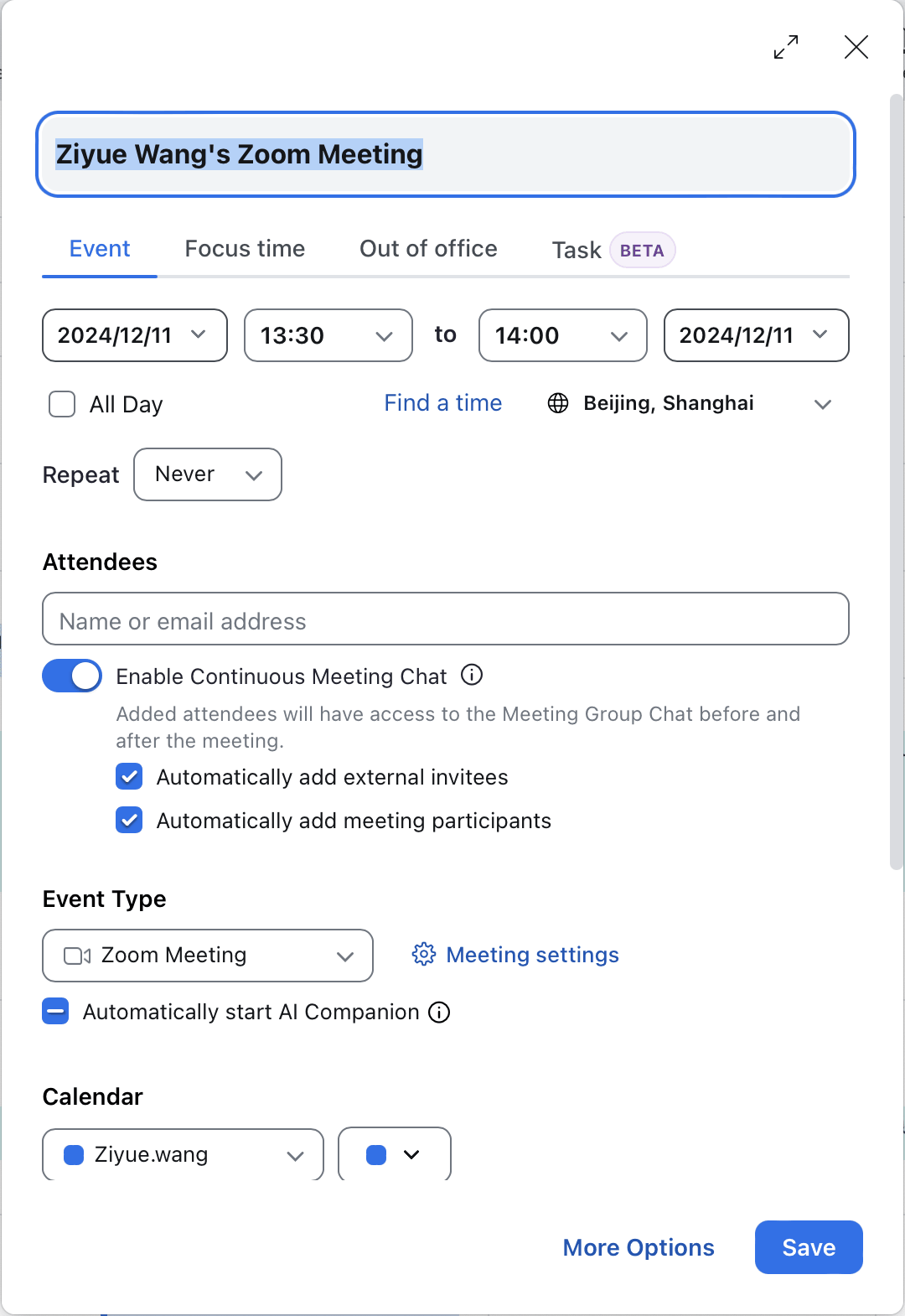
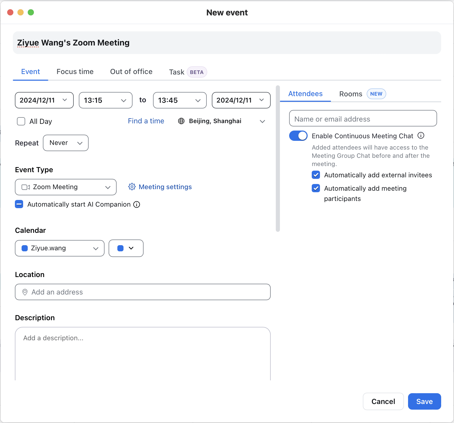
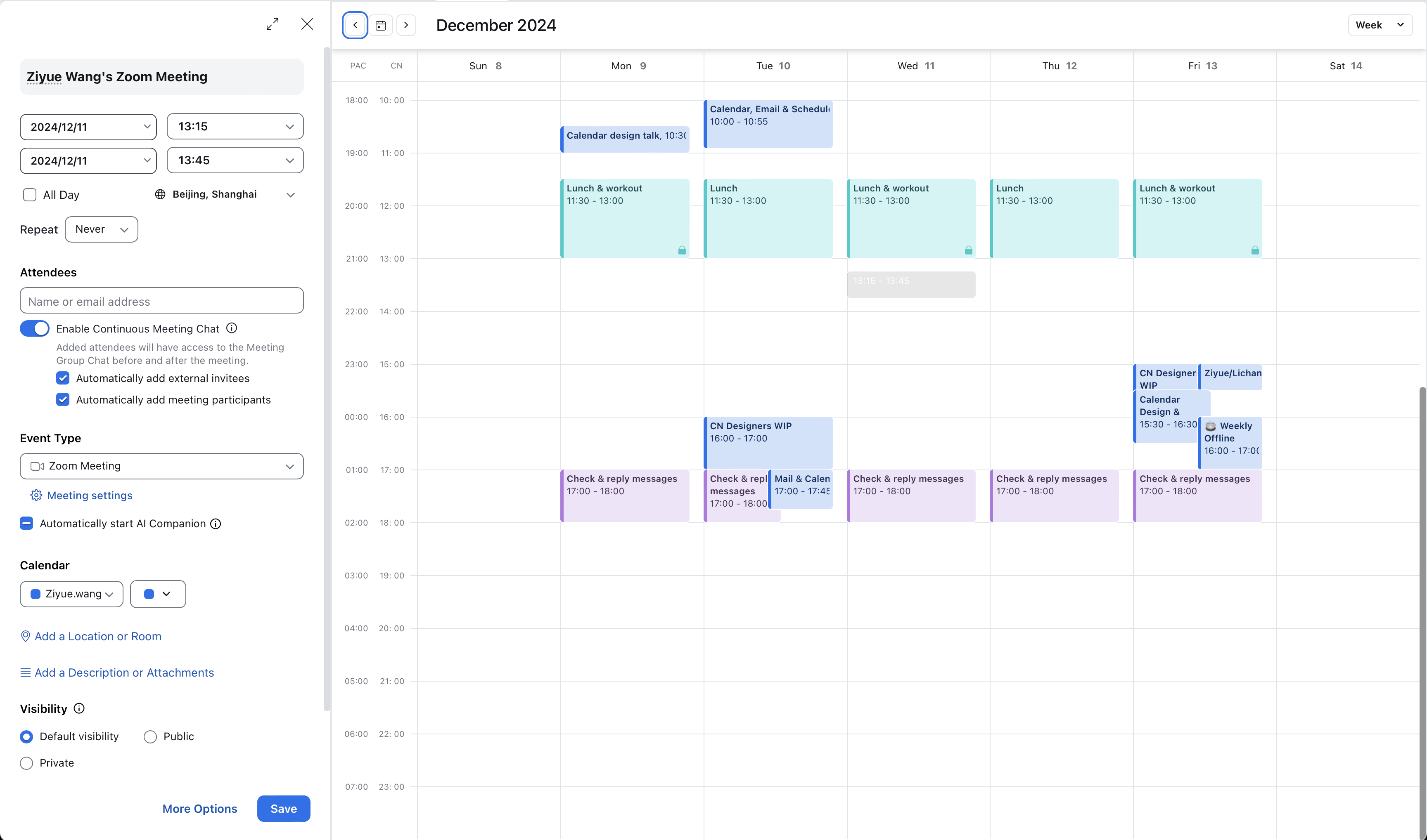
Previously: three separate views

Reducing three views to two simplifies navigation. Users can access all settings and availability in one workspace, without switching between separate pages.
The compact card keeps quick event creation within the calendar. Every setting remains accessible, with sections expanding directly into editing when selected.
Find time prioritizes the calendar. More options prioritizes settings. Both open the same workspace, where one click on the central button switches the panel proportions without opening another page.
08 Creation and viewing
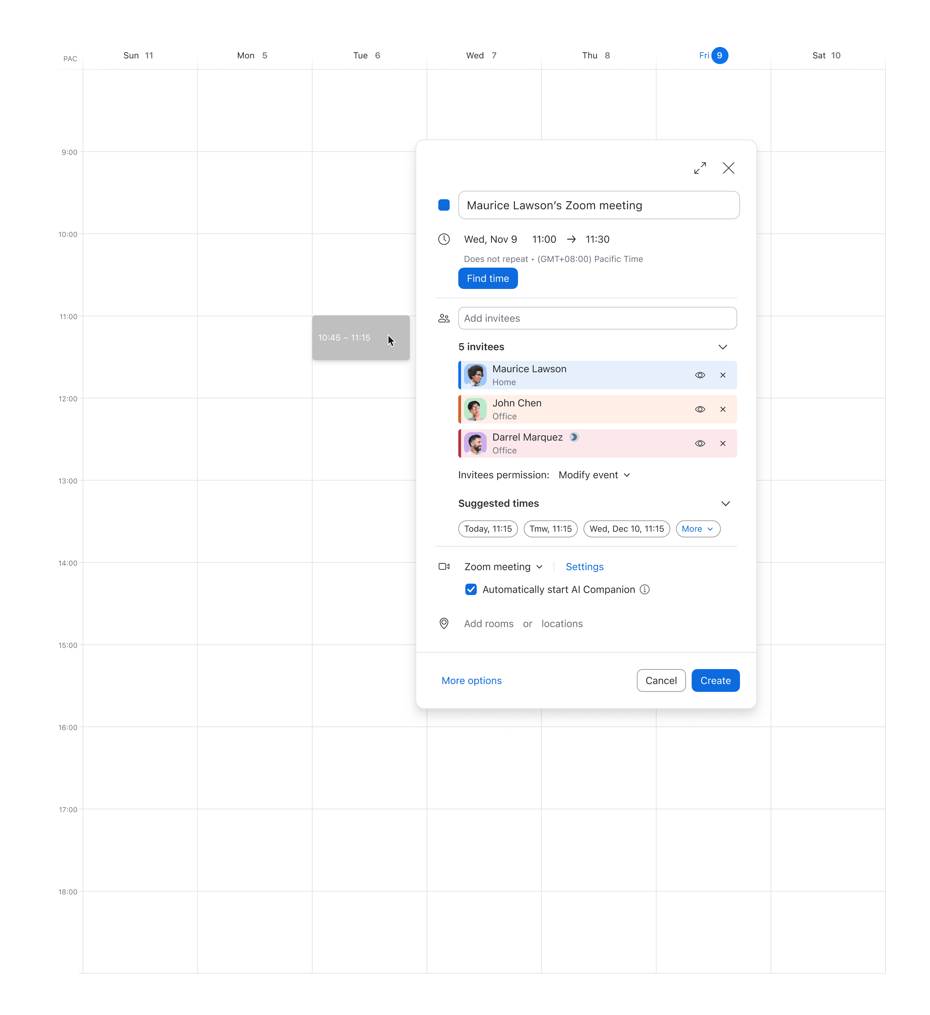




Related settings are grouped under shared icons, with current values summarized before editing. This gives the creation card a recognizable structure that can carry through to the saved event.
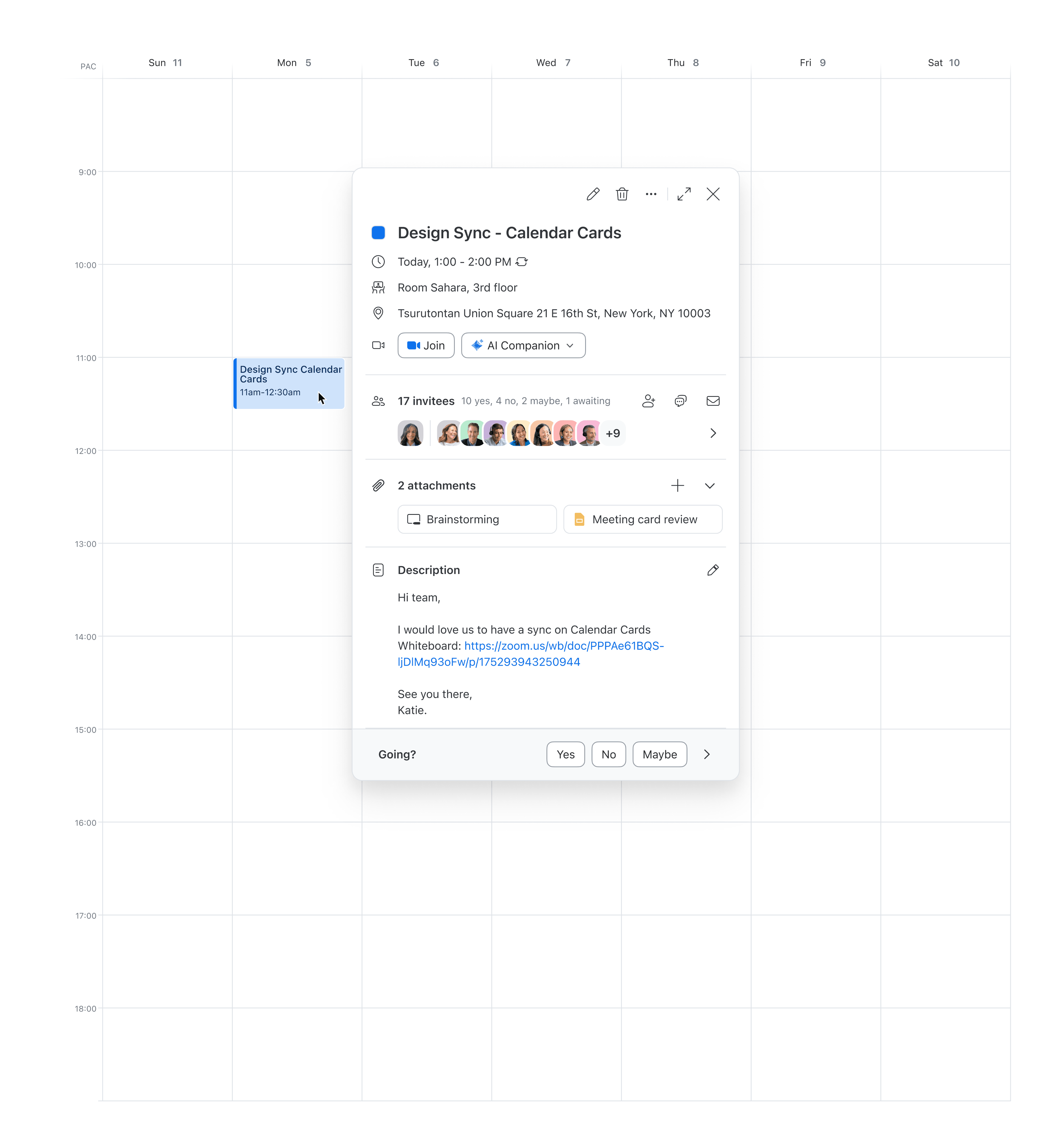
Shared icons and grouping help users recognize the details they entered when viewing the saved event. Controls change to support actions such as joining, responding, or reviewing invitees.
09Interaction pattern
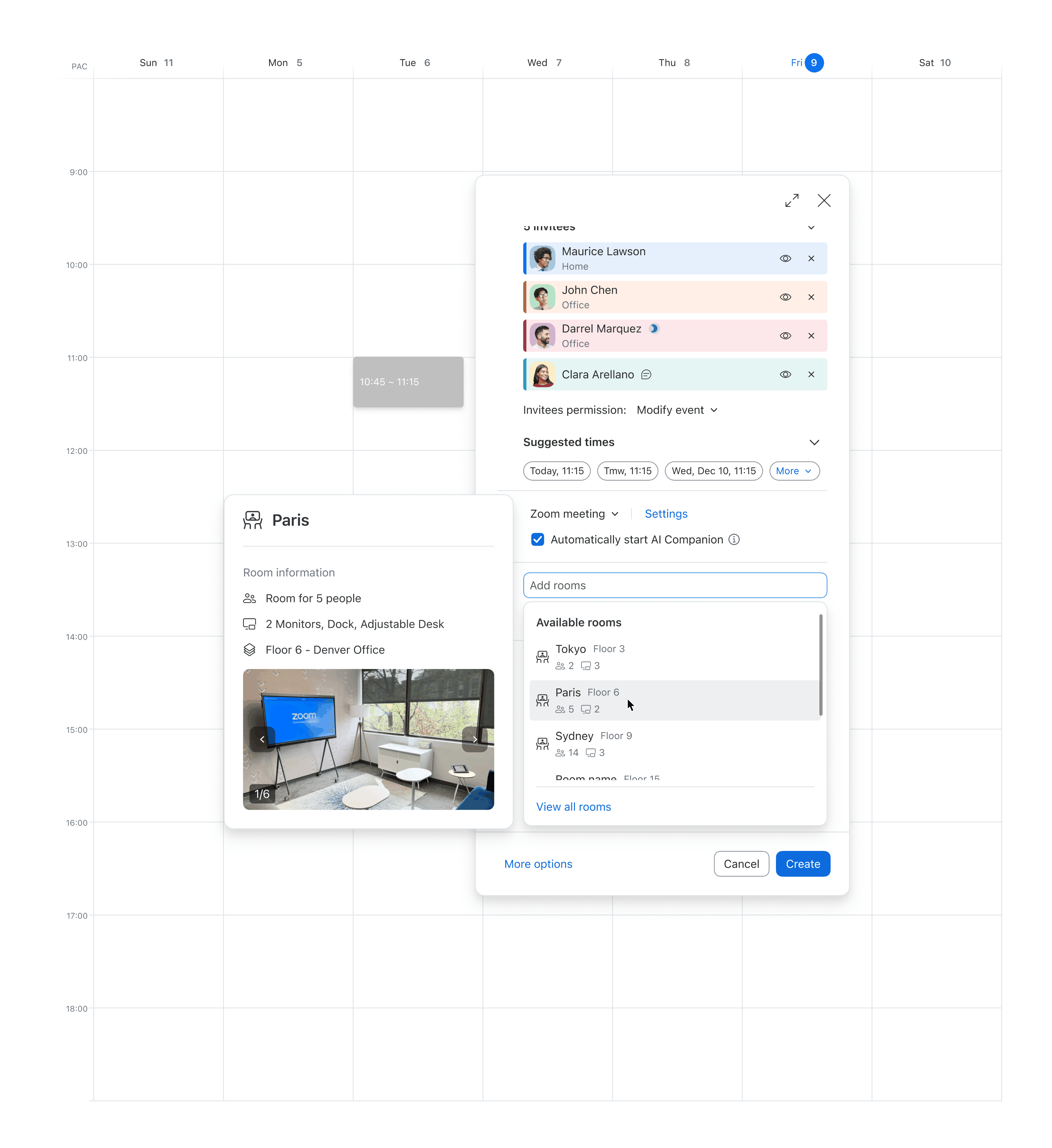





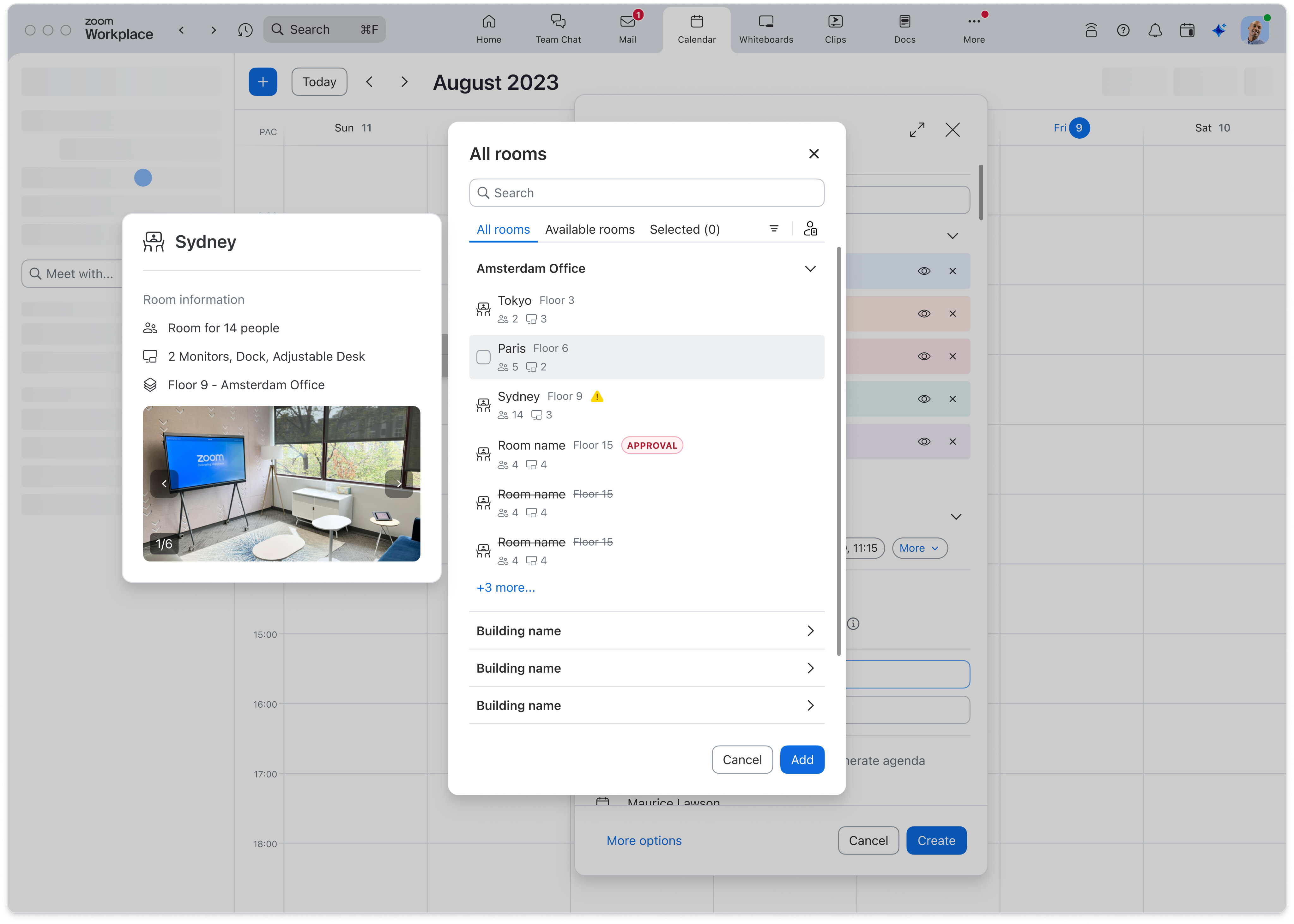
More involved choices get a dedicated dialog. For rooms, View all rooms opens a broader search across buildings, with room details available for comparison before adding a room.
10 Beyond this project
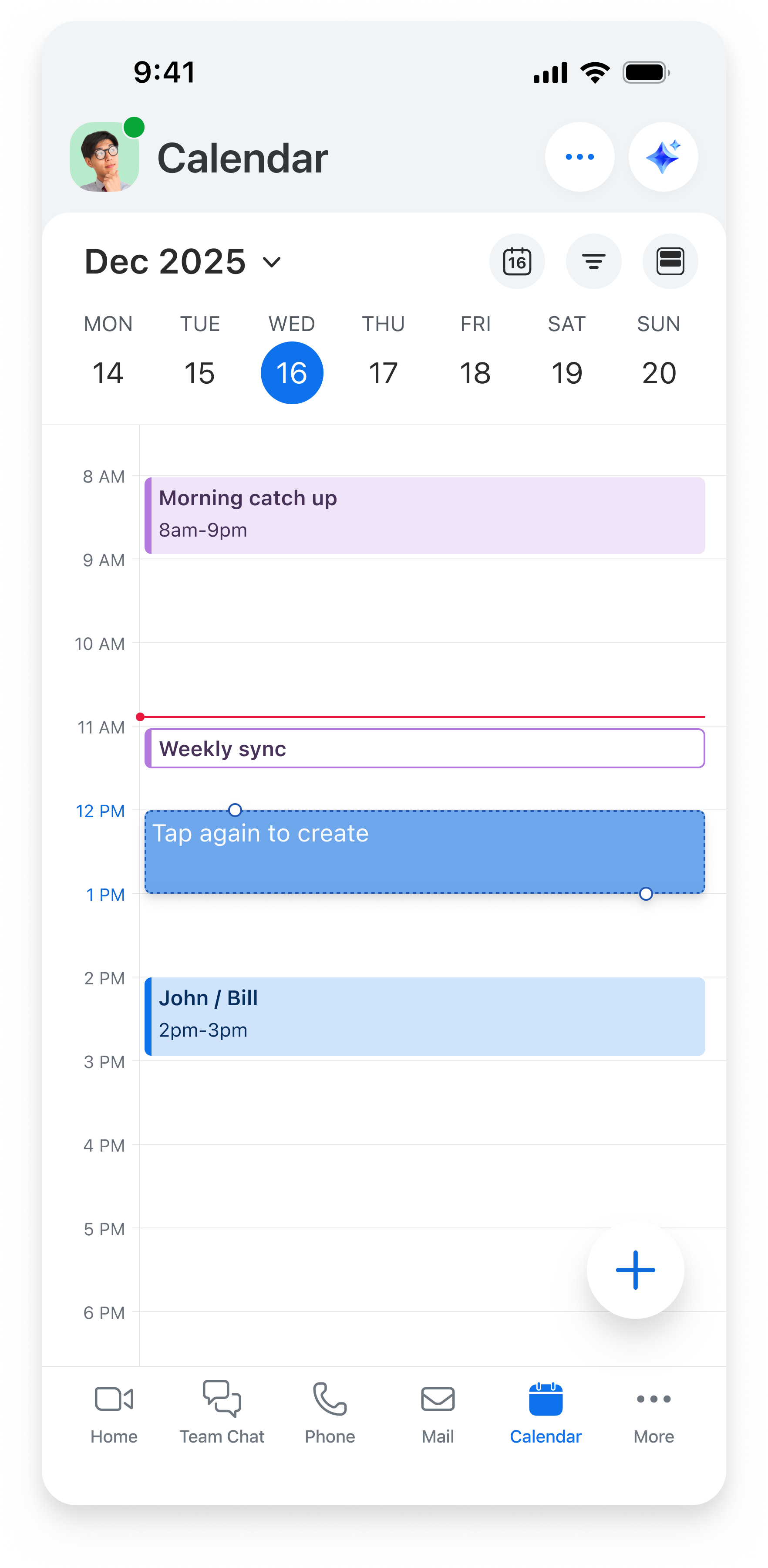
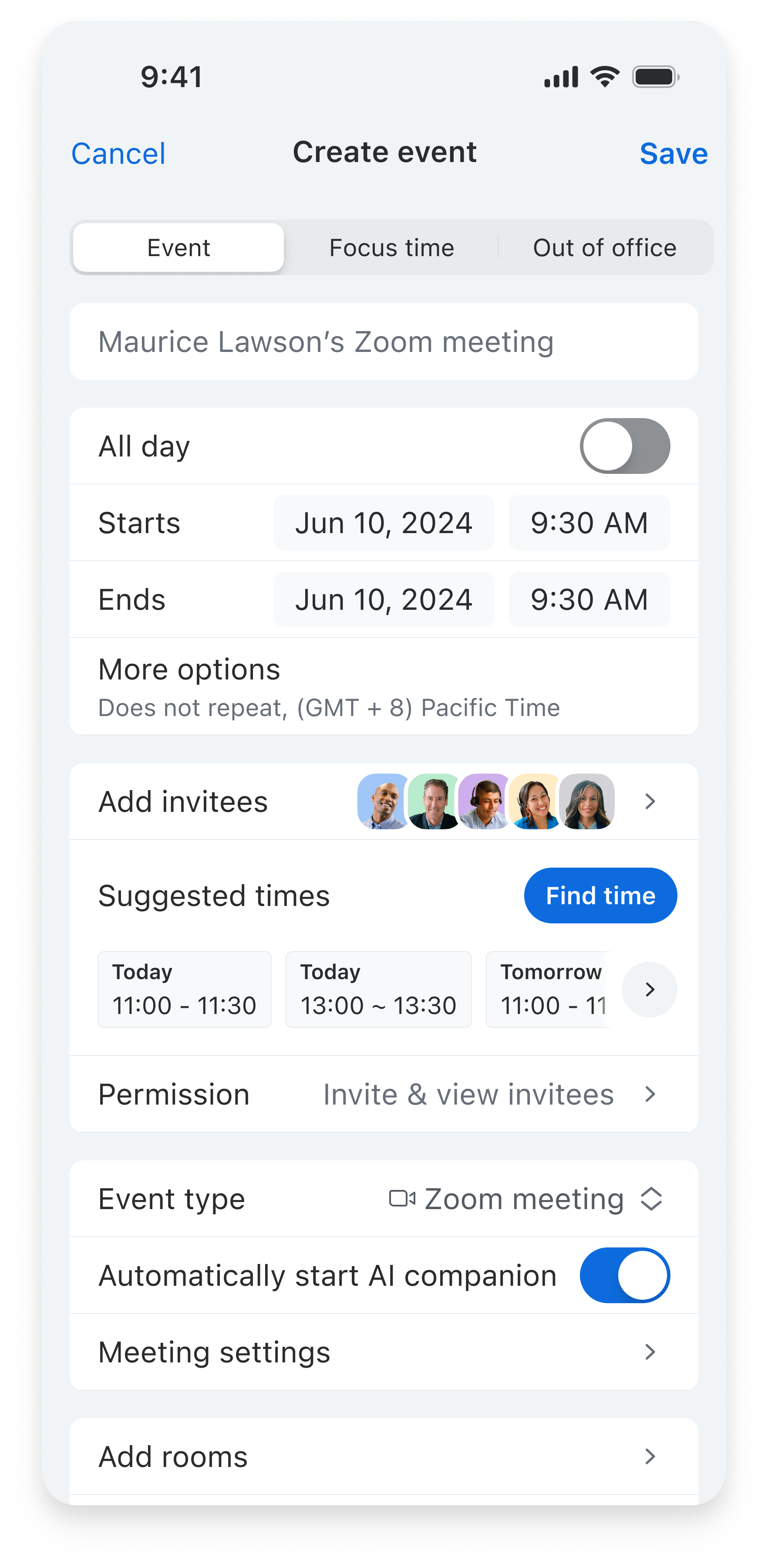
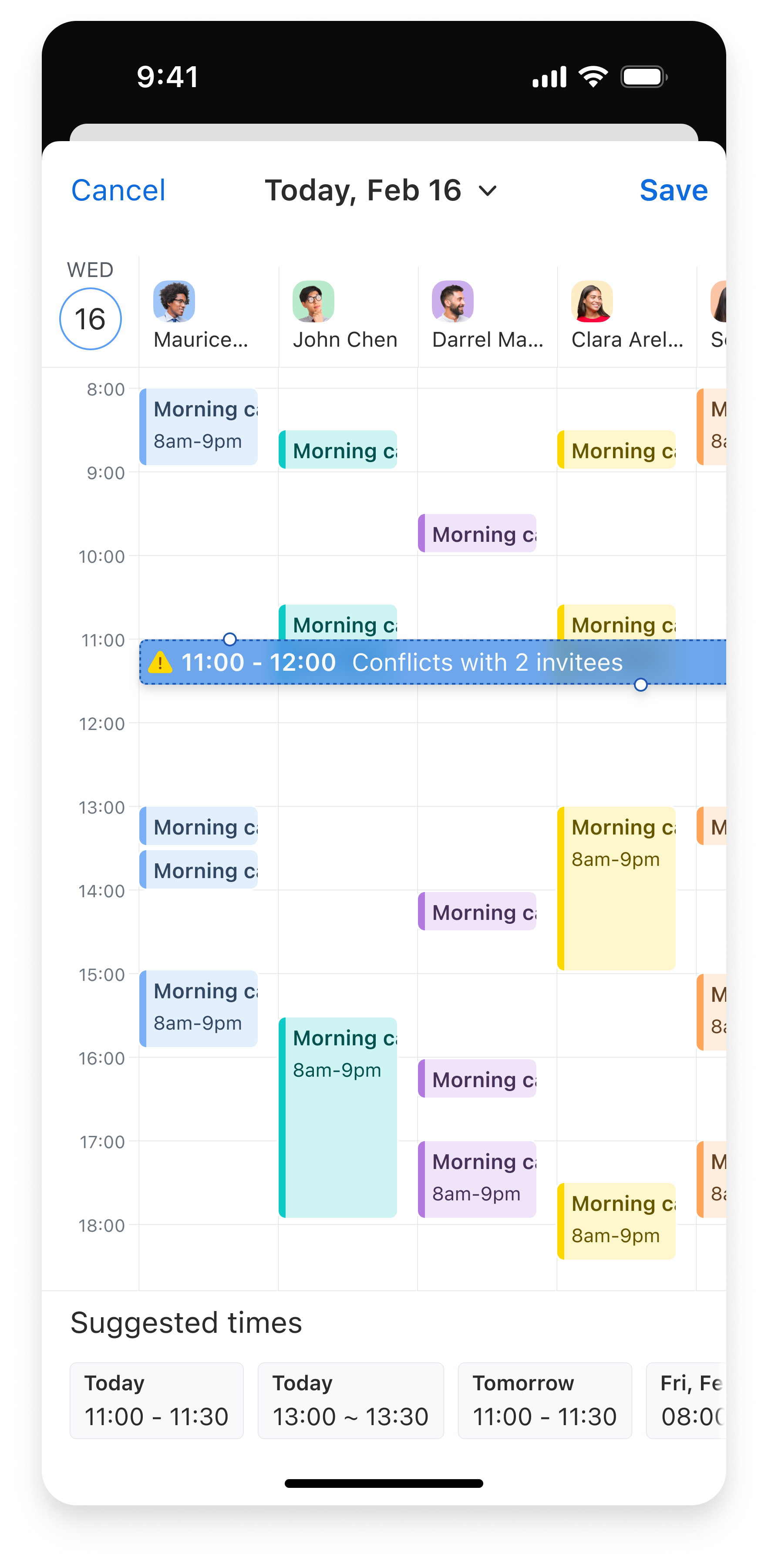
I adapted the grouped settings and availability flow for mobile, carrying the same scheduling logic into a smaller screen.
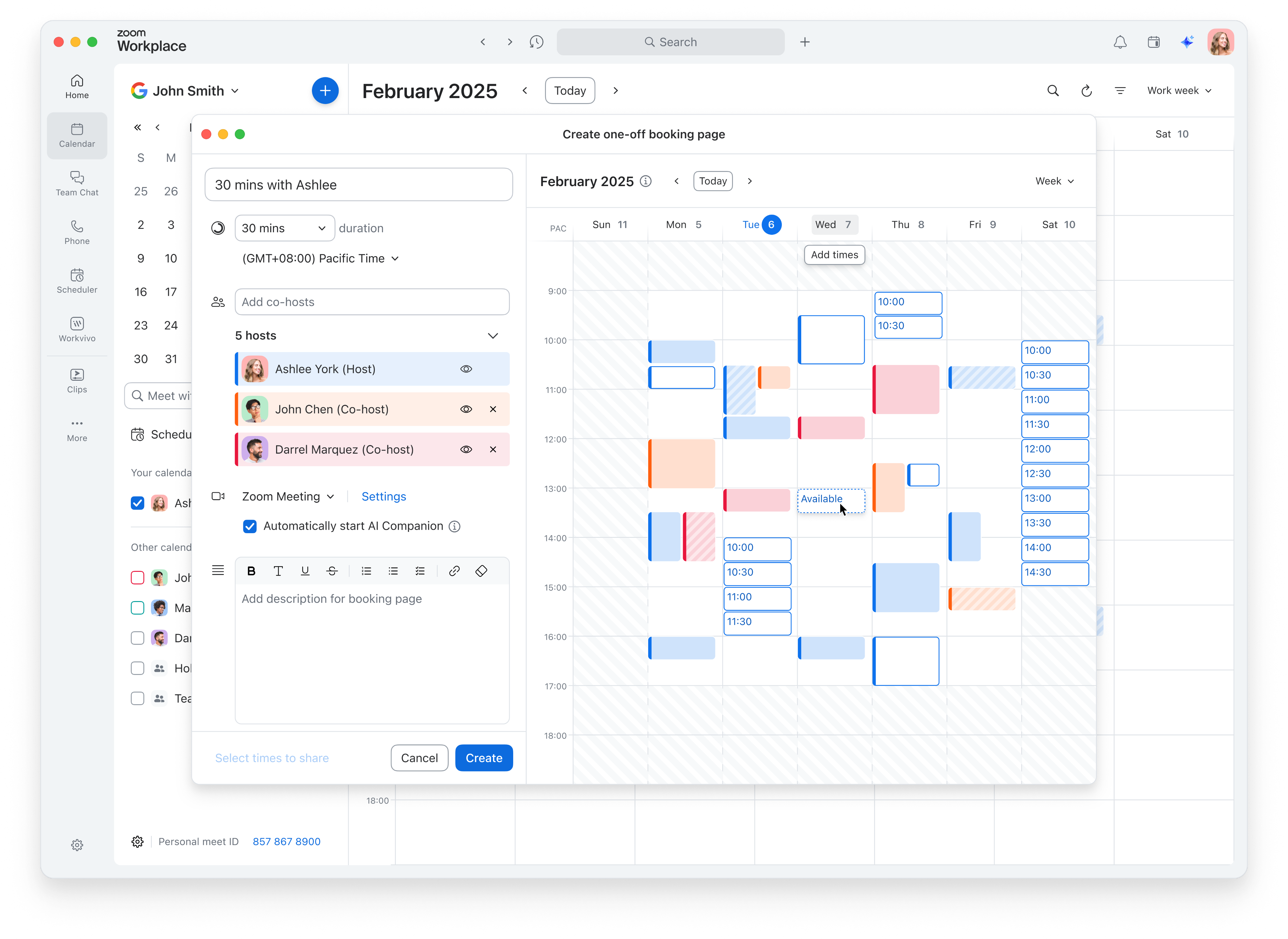
I reused the layout for Scheduler booking links, bringing meeting settings and available times together within Calendar.